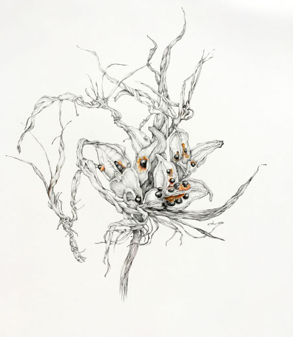
The dry Strelitzia seedhead offers me lots of opportunities to explore its wonderful intricate and messy form. This drawing follows on from the smaller one I did recently (see here for images). I have used a different angle, more front on, and enlarged it by about 2, maybe 3, times. The drawing is relatively faithful to the actual object, but I couldn’t resist exaggerating some of the tendrils and dried petals, they were asking to be taken on a journey. I love the abstract qualities of this seedhead, and the eccentricity of it. The glossy black seeds are embedded in bright orange fluff, the only colour apart form the tones of brown.
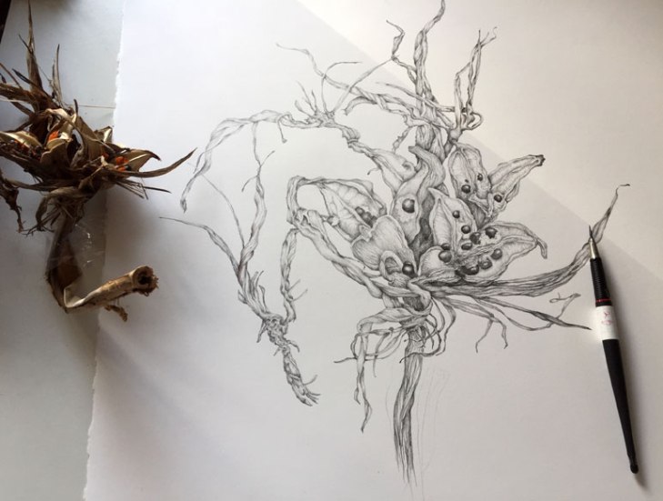
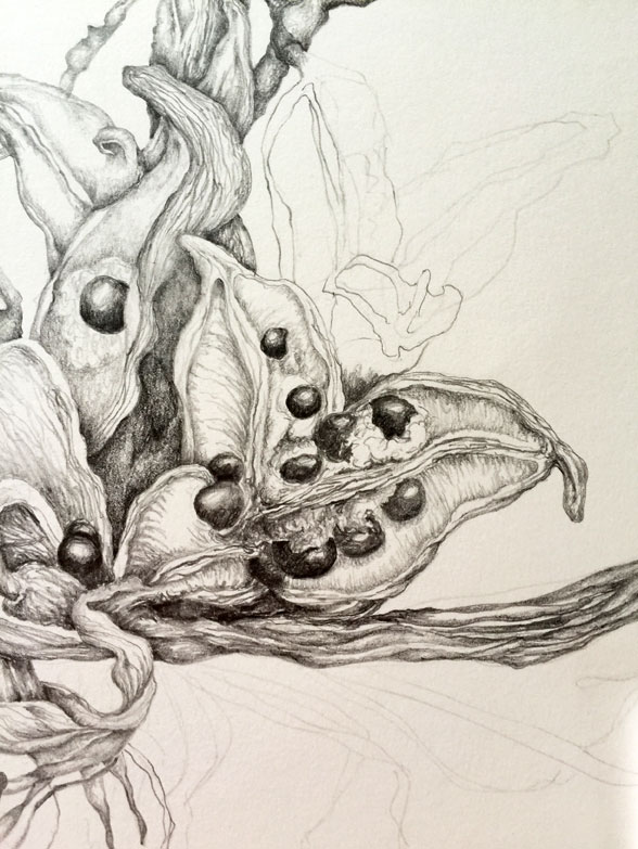
The decision to add colour was made at the beginning, but its something I still feel unsure of – there are hints of brown in some of the shadows, but the main colour is in the fluff surrounding the seeds. Now I am wondering whether this was a good idea, I think it was, but maybe the colour should be more intense … what I don’t want is for it to look gimmicky, the colour should be a natural addition, not something that is noticeable for its oddity. I will be interested to hear opinions on this! Below is a photo of the drawing on my desk before I added the colour, and a detail while the drawing was coming together.
I used 2B and 8B graphite pencils and a 2B 2mm clutch pencil, which I can sharpen to a needle sharp point. The image is about 32 cm wide and 38 cm deep.

An interesting subject that you have portrayed with the upmost sensitivity and respect, Anna. 🙂
LikeLiked by 1 person
Thank you so much Richard, what a lovely comment!
LikeLiked by 1 person
This is wonderfully intricate and detailed – so beautiful! ❤️
LikeLike
beautifully drawn
LikeLiked by 1 person
Thank you, much appreciated.
LikeLike
These are odd looking things, but have such intrinsic beauty. I’m so pleased you like my interpretation!
LikeLike
Adding the colour was just what this needed! Anymore would over-egg the drawing, but it highlights a key piece of information. Can’t say much on intensity, mainly because you can never tell colour accurately on a screen. Looks about right, I wouldn’t push it much further intensity wise. Lovely image Anna!
LikeLiked by 1 person
Ah, thank you Leonie, you have put my mind to rest! I felt the colour was the right thing, but it could be so wrong … I feel encouraged now!
LikeLike
Beautiful. So incricate.
LikeLiked by 1 person
Thank you, I appreciate your comment!
LikeLike
I meant intricate! That’s okay. I bet your drawing took a long time.
LikeLiked by 1 person
I knew what you meant! It did take quite a while, but I had to stop, step back and look at it for a little while before continuing so that added to the time. Once I was drawing I would get lost in it.
LikeLike
😄😄
LikeLiked by 1 person
Super Anna. So clean and sensitive.
LikeLiked by 1 person
Thanks Rebecca – it was a lovely thing to work on, I didn’t want it to end!
LikeLike
I don’t think there was a wrong decision to be made here. The drawing looks marvellous with the colour and without. It certainly doesn’t look gimmicky – and my very first thought when the drawing came up on my screen – the FIRST thought – was how much I liked the seeds-and-orange. I must say, you are a master of placing a thing on a page too, you have such a strong sense of design. I’m glad you show us the third image too so we can appreciate the fine details and the continual freshness of your drawing. To me your drawing conveys the joy you found in the subject.
LikeLike
You know, it hadn’t occurred to me that either with or without the colour could be right, yet in most other things I often feel ANY decision is the right one, because it is the one that somehow bubbles to the top. So, that does make me feel relieved! In another drawing I am working on there is quite a lot of colour on top of graphite, and I enjoyed the interesting results that came from that, which is probably where this decision came from. And yes, I did find joy in this, I’m very happy it comes through!
LikeLike
This is beautiful Anna. I think the color is fine and draws attention to that part of the plant. You’ve done a stunning job.
LikeLiked by 1 person
Thank you Jean – I value your opinion, that is a lovely thing to hear!
LikeLike
You’ve so many positive replies, I almost feel silly leaving another. Lovely work and the colour thing? Yes, for me, comparing the B&W to the tiny addition of colour, the colour seems to add a little touch of magic.
LikeLiked by 1 person
I value every comment, too many is never enough! And that is a nice insight, I love the idea of the colour adding magic. Thanks Bella!
LikeLiked by 1 person
I love the colour, not too much that it overwhelms, it is lovely.
LikeLiked by 1 person
That’s good, getting the balance with the colour I think is probably the hardest part. Thanks Rosie, good to hear from you!
LikeLike
☺
LikeLiked by 1 person
Anna this is absolutely beautiful, and I LOVE the addition of the color.
LikeLiked by 1 person
That is very good to hear Lisa, thank you so much!
LikeLike
Beautiful and the spots of color just perfect. I wouldn’t push the color much further.
LikeLiked by 1 person
Yes, I agree – I think less is more in this case! Thanks Nancy!
LikeLike
Just discovered your site in my reader. Love your work particularly the pencil drawings.
LikeLike
Thank you so much! Drawing is my great love, and pencil comes very high in my favourite materials, so I’m delighted you like them.
LikeLike
Nice detail. 😊
LikeLiked by 1 person
Thank you! I do love getting lost in the detail!
LikeLike