There is a particular pleasure in working on small panels – they can become artworks independently or put together to tell a larger story. They can be worked on progressively, a few at a time, then set aside and more done, in a way that is difficult with a larger single panel work.
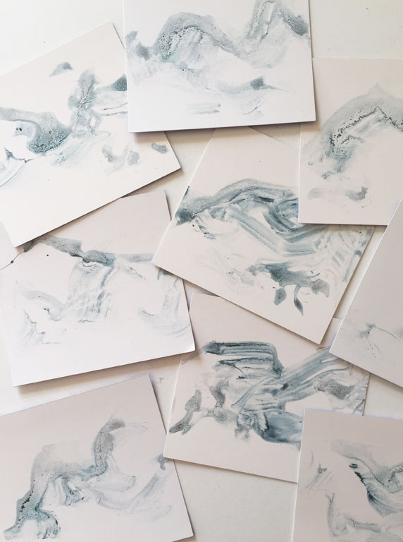
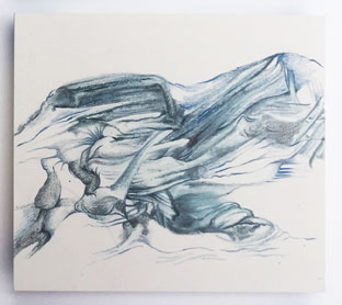
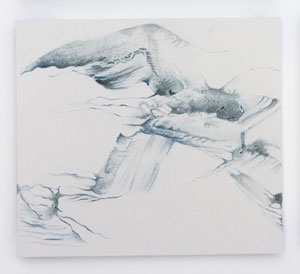
The genesis for this work came from browsing in the paint department of our local hardware store. The bundle of neutral coloured paint swatch cards I collected became my support. The perfectly smooth surface was a delight to work on. The picture above shows some of the cards with the initial marks that were my starting point. These were created using Liquid Pencil (one of my frequently used kinds of media, see here for other examples). I made a thin solution of Liquid Pencil, which is a paste of graphite, with some colour added, in this case blue, and used an old and very battered paintbrush which had bristles sticking out at all angles. This made random and unexpected marks. Once it was dry I could start working into it with coloured pencils – only tones of blue in this case – plus occasional marks in graphite.
In the beginning the base marks could have developed in any direction, but gradually a sense of cold, wild, barren landscape began to emerge. Having visited Iceland in winter a few years ago, and more recently Norway in winter, memories of those landscapes must have influenced my interpretation.
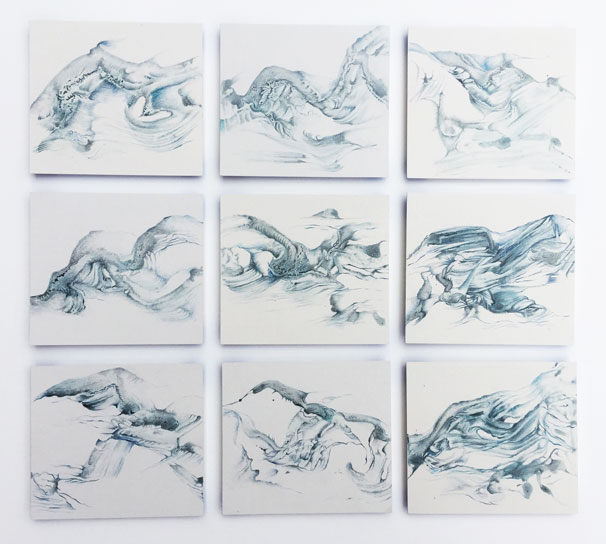
For the final combined artwork I chose nine panels and arranged them so that they flowed together – this is something that was not planned in the beginning, but was just serendipity. The title I gave this is ‘The End of the Earth’ an intended double meaning to indicate concern for the impact caused by climate change on landscapes such as these.
Each panel is 9 x 10 cm, and I mounted them so that they floated just above the surface, and they are now in a white frame. At present the artwork is hanging in the Ewart Prize, a selected exhibition in Willoughby, NSW. I was pleased to have the work hung – 120 entries came in and 72 were selected. However, I have submitted this artwork to 2 other exhibitions earlier this year and it was not selected for either. After many years of doing this, I am still disappointed when a work is not selected, but not daunted. I have great faith in this piece and felt sure it would eventually be recognised!
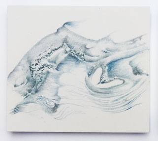
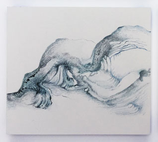
Below are the individual panels, click on them to see them larger.


Nice work, Anna. Good luck!
LikeLiked by 1 person
Thanks Richard – fingers crossed!
LikeLiked by 1 person
Wow these are amazing anna. On first glance they actually looked like anatomical drawings.Keep up the good work!
LikeLiked by 1 person
I had never thought of these being anatomical, but I love that idea! Thank you so much Meegan.
LikeLike
I love the movement in these pieces together and by themselves. I love those colored swatches too and this is a great use of them. Congratulations on being accepted into this show, how exciting!
I may be super late to the party but I love the format and look of your blog. I usually read blogs through wp’s reader which takes out all the beauty out the format.
LikeLiked by 1 person
It’s so easy to pick up a pile of those swatches, in a range of different colours that it’s nice to have found a use for them! I was very happy to be accepted into the show, the standard of work is very high this year.
I’m so glad you like the new look of the blog – I got fed up with the ads popping up, so when there was a special deal on I decided to go to a paid version. Hopefully it looks a bit more professional!
LikeLike
I knew there was potential in those little swatches! You’ve made good of them for sure!
It must feel great to be accepted into an art show, I would be all kinds of nervous to enter!
I know we have similar backgrounds in design. A well designed blog thrills me, and no ads, even better! It’s a winner for sure! And so organized!!
LikeLiked by 1 person
When I first started entering art competitions I was disappointed not to win, I’ve now got to the point of just being happy to be accepted! You do have to develop a thick skin and have faith in your own work, otherwise it’s way too painful, not to mention expensive!
I did very little to tweak the design I chose this time for the blog, I think it does suit my requirements well. All kudos to the designer who created it!
LikeLike
The End of the Earth sounds ominous and foreboding. Fantastic free flowing set of works, Anna.
LikeLiked by 1 person
We are in ominous times aren’t we? I’m delighted you get the sense of flow of these pieces. Thank you!
LikeLiked by 1 person
So beautiful, Anna, and an inspiration. Thank you for showing them.
LikeLiked by 1 person
Thank you so much Anne, that is a great compliment!
LikeLike
Anna these really do have an icy landscape feel. The chill you feel in your bones come through in these pieces. And I love how you have mounted them together. Congratulations about getting the piece into the exhibit.
LikeLiked by 1 person
Thanks Nancy, I’m delighted that you get that feel of the cold, icy landscape. It was an interesting exercise to work out how they fitted together, but it they fell into place quite naturally in the end.
LikeLike
The title “The End of the Earth” immediately takes the viewer’s brain to ‘landscape’. But when you are scrolling down the page looking at each piece by itself, there is something anatomical about them – rather like sleeping magical beings. You know, muscles, bits of wing – that sort of thing – no doubt influenced by the studies of dead things that you draw. So one can see menace in these, which I may say, is very Anna Warren, as I often see menace in your art.
But seeing them all together I am reminded of something else – the fine blue and white bone china of (I think) the Netherlands. So subtle and gentle on one hand, and a bit spooky on the other. So much food for thought.
LikeLiked by 1 person
You know how happy I am that you find menace in my work! You are the second person to find anatomical details, I hadn’t noticed it when I was working on the drawings, but now I can, very clearly. I am working on a new set of panels now – which are brown where these are blue – and mythical and prehistoric creatures seem to be emerging. I felt the cool gentleness of the blue in these did convey other meanings, but hadn’t thought of the blue of Delft (I think …) pottery. It is such a pleasure to hear analysis of my work, other people find things that I had no idea were there. I heard an artist in a podcast recently say that all our art is a composite of our life experiences, from our childhood on, and I think I agree with him.
LikeLiked by 1 person
Anna, your work is fun to analyze because there is so much suggestiveness in it. And yes, Delft is what I meant. I know you are happy with me finding menace in your work so I never hesitate to say when I see it. That’s so curious that you weren’t aware of the anatomical details – how much we do is unconscious. And how exciting when somebody else points out what is obvious to him or her but you’d never realized. That is one darn good reason (only one of many) to have a blog.
Mmm – I like that last bit about art being the composite of our life experiences….
LikeLiked by 1 person
There is a large element of the unconscious in my work, sometimes it works and other times not so much … last night was the opening of the exhibition ad I was awarded Highly Commended, which is effectively the first prize for drawing so I am pretty happy today!
LikeLiked by 1 person
Really fantastic news – which I also enjoyed seeing on FB.
LikeLiked by 1 person
Thanks Julie – it’s encouraging to have my work appreciated by someone who is a complete outsider to my world, somehow adds validation to what I’m doing. However, I have realised that the most important thing is for me to have faith in my own work, no matter what!
LikeLike
Loving these! So much energy. Wonderful to see your work again.
LikeLiked by 1 person
Thanks Elena – its been good to see yours again too! I’m following you on Instagram now to, look forward to seeing more there!
LikeLike