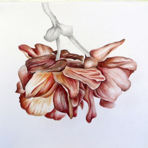
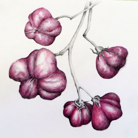
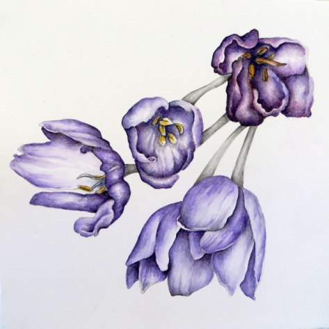
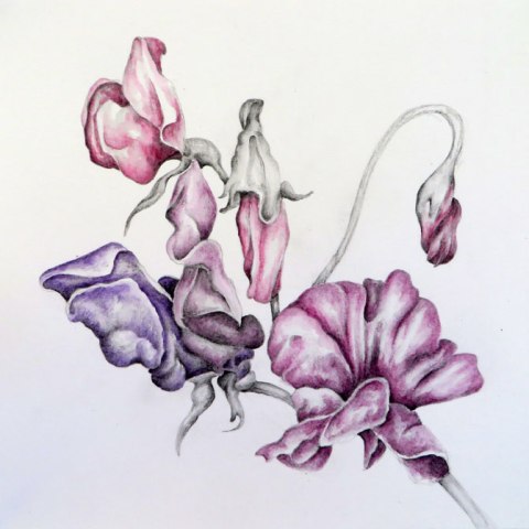
The experiment with water soluble pencils continues, but a little differently, as I have decided to add colour. Having the tonal drawing beneath gives a useful structure for the colour to go on top. I decided to leave some parts in graphite for contrast, and highlight the main parts of the flowers/berries with colour. The colour is simple, almost monochrome in each case, with no real attempt to create botanical reality, it is there more to enhance the shape and form, and maybe take the images away from their plant origins into another kind of object.
I used Faber Castell watercolour pencils (Albrecht Durer), so that I could continue to draw, but adding water gives more of a painterly feel, and some unexpected results.
The above image was inspired by a double begonia flower, below the inspiration came from spindle berries, crocuses and sweet peas.
All are 23 cm x 25 cm. Some of the drawings without colour can be seen here.

These are breathtakingly beautiful. While quite new, they also take me back to your jewellery (some of which I have) which were painted with oils – and your piano keys. These are such a rich gorgeous series, they are bursting with vibrancy.
LikeLike
Thanks Julie – I can see see what you mean about the connection to the oil pieces. These started fairly muted, but I just kept adding layers – getting braver I think!
LikeLiked by 1 person
Stunning, Anna!
LikeLike
Thank you Sue, I appreciate that!
LikeLiked by 1 person
Beautiful!
LikeLike
Thank you Mary, lovely to hear from you!
LikeLiked by 1 person
I’m becoming lost in these beautiful colours and forms Anna 🙂
Depth and delicacy rolled into one .. two .. three ..
LikeLike
Thanks Poppy! The subject matter offers so much, these are fun to lose myself in. (I’m glad you are Poppy again!)
LikeLiked by 1 person
.. it’s so strange Anna but I just couldn’t get used to be so formal here on WP with friends I’d made .. so Poppy it is 🙂
LikeLiked by 1 person
I have my imaginary Poppy picture of you back in my head now – I like it!
LikeLiked by 1 person
These are lovely Anna, the graphite underneath the colour gives it a muted quality, very delicate. Karen
LikeLike
Thanks Karen – working like this is like the traditional way of starting an oil painting, with a monotone underpainting, like you I like the muted colours that result from this.
LikeLiked by 1 person
Anna-Nice! I especially like the first drawing.
LikeLike
Thanks Nancy! Yes, I quite like the intricacy of that first one too.
LikeLike
Anna somehow I missed this post! I would know your flowers anywhere, they are your signature. So lush and deep! It must be the way you apply your pencil strokes, it looks so velvety. Just lovely!
LikeLiked by 1 person
Its so nice to know they can be identified with me! They have been really pleasurable to work on – I thought I was finished, but there may be a few more to come … thanks Cathe!
LikeLike
I like the richness of the colours you are getting with these pencils.
LikeLike
Thanks Janina – I am surprised myself at the intensity that can be achieved, just layer upon layer.
LikeLiked by 1 person